Date
27 August, 2024
Client
Eco ReLoop
Category
Brand Guide
Location
New York, USA
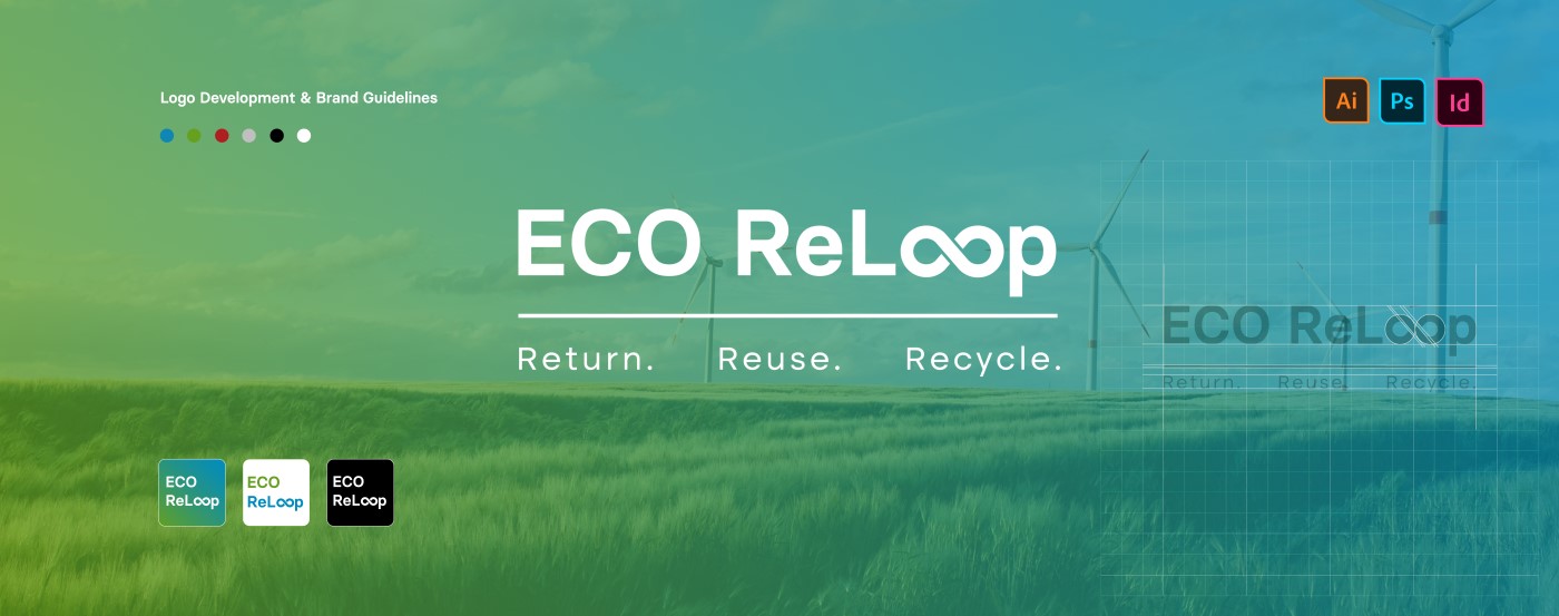
Eco ReLoop is a forward-thinking energy solutions company committed to closing the loop in the global energy cycle. We specialize in technologies and systems that return wasted energy back into circulation, reuse resources efficiently, and recycle energy for a cleaner, more sustainable future
Challenge & Solution
The core challenge in developing EcoReLoop’s brand identity was to create a modern, memorable design that clearly conveyed sustainability and the circular economy, stood out in a crowded green market, and appealed to both businesses and individuals.
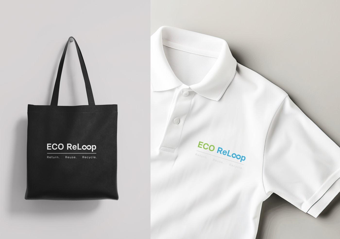
We responded to the challenge by designing a distinctive, infinity-inspired logo that embodies the circular economy, paired with a cohesive visual system of colors, typography, and brand elements. This approach ensured the brand felt modern, professional, and approachable, allowing EcoReLoop to stand out in the crowded sustainability market while appealing to both consumers and corporate clients.
Our Process
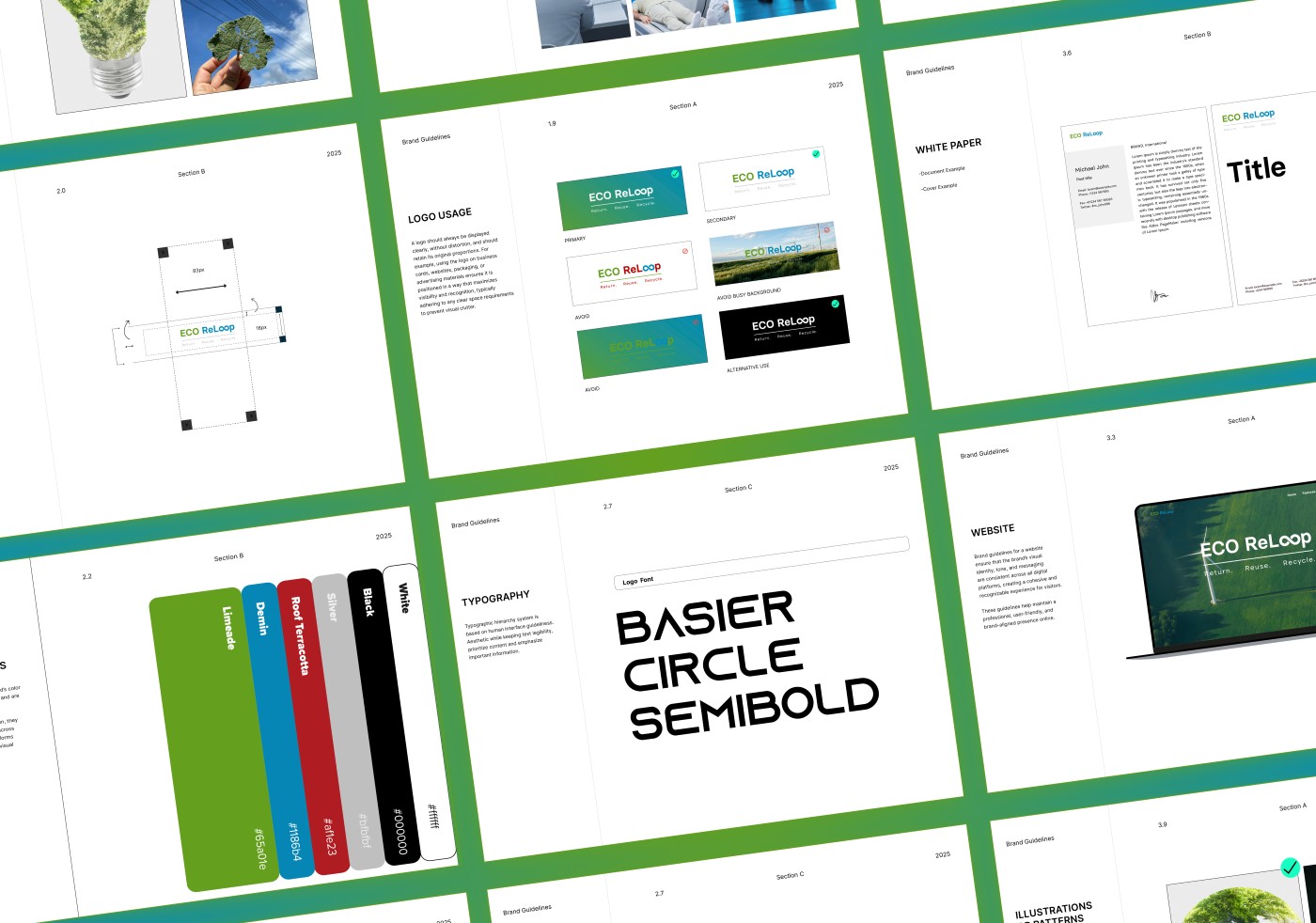
The brand guideline creation included:
- Discover – We started by researching the sustainability and circular economy landscape, analyzing competitors, and identifying opportunities to position EcoReLoop uniquely. This helped define the brand’s mission, values, and target audience.
- Design – The design phase centered on creating the infinity-inspired logo, symbolizing the circular economy and EcoReLoop’s commitment to sustainability. We developed complementary color palettes, typography, and visual elements that reinforced the brand’s modern, eco-conscious identity.
- Development – We finalized the logo, colors, typography, and iconography, and applied them across collateral, digital templates, and other brand assets. The identity was designed to be cohesive, scalable, and versatile across platforms.
- Refinement – Feedback from stakeholders and target audiences informed final tweaks for clarity, impact, and consistency. The result is a polished, memorable, and professional brand identity ready for launch.
Result Driven
The new brand identity positioned EcoReLoop as a modern, credible leader in sustainability. The infinity-inspired logo and cohesive visuals strengthened brand recognition, engagement, and stakeholder confidence, leading to increased partnerships and market presence.
- Stronger Brand Recognition: The infinity-inspired logo created a memorable symbol of sustainability and circularity.
- Increased Engagement: Cohesive visuals and messaging resonated with both consumers and corporate clients.
- Enhanced Credibility: A professional, modern identity built trust with stakeholders and partners.
- Business Opportunities: The refreshed brand attracted new collaborations and partnerships.
- Market Presence: EcoReLoop’s identity clearly differentiated it in a crowded sustainability sector.